After looking around on Friday at everyone's projects, I noticed that there were something things that I could apply to my own project. For example, Jerry was commenting on Ashley's project, and stated that her concept should affect everything, even the light switch. This got me thinking that maybe I haven't been using my concept fully and that I should incorporate it more in the way my design is laid out. Hugh Sutphin was also giving some advice on her project and suggested that she might make the building more like an open mall, where all of the stores are open and transparent, which I though could be a way that I could take that comment and apply it to my own project by thinking about increasing the transparency throughout the stores and apartments. After looking at Monica's and hearing what Jo had to say, I have to agree with her on some things. For instance, Jo pointed out that Monica should have a title for her project to explain some thoughts behind it and to set her project out from the rest and make it unique. I then realized that I hadn't come up with a title, so I need to think about whether I was to make my title something about my Haiku Graphic or something different.
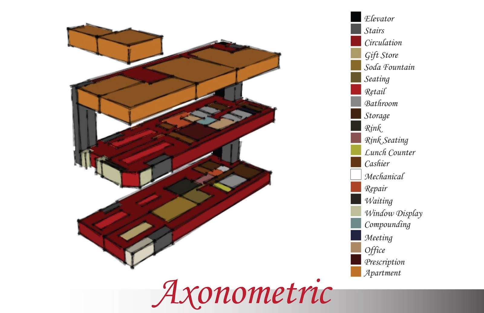
During my walk around the room, I heard some students commenting on each other's project and it made me interested to hear about some opinions that my peers had. Several of them, like Shirley, Ana, and a few others told Jackie that it seemed as if she had too much circulation throughout her building, which she claimed was for the purpose of riding bikes. While I think that is a good idea, I do believe that she should have marked off a rink or some designated area for the bike riders so that they aren't riding around everywhere and so that people looking at her project could understand better. Morgan brought up the issue of safety in Kristy's project due to her stairs being too far away from the wall without a proper handrail. Safety normally isn't the first thing that we think about in studio, although it should be. Normally, people get too caught up in what they want to achieve, and then try to find a way to make that safe, when it should be the other way around. I need to look back onto my project and think about what I think could be safe and what I would need to change. Kristy made a good point when talking to Shirley about her project. She noticed that the gift shop is located in the basement, but that it doesn't currently have anything else with it to attract attention and to get anyone to go down into it. This relates to my project because my gift shop is also in the basement and I am mostly relying on the Soda Fountain to get people downstairs to look at it, so I think that I need to incorporate something on the 1st floor so that people know that there is a gift shop downstairs to get them to look at it.


